Required exercise Photo Edit
 This is the original picture. It is pretty busy.
.png) In this picture I tried to capture the people without the distraction of the cars, but I'm not sure that was successful.
In this picture I tried to capture the people without the distraction of the cars, but I'm not sure that was successful..png) In this picture, I wanted to focus on the line of traffic. This was my first time playing around with the photo editing software on my new computer so I wasn't sure how to zoom in more.
In this picture, I wanted to focus on the line of traffic. This was my first time playing around with the photo editing software on my new computer so I wasn't sure how to zoom in more.
.png)
I decided to focus on the buildings in this shot and I love the way it turned out because this could stand separately without the foreground. This looks like an entirely different picture.
.png)
I put it on Autofix for this one just to see what it would do. The software decided to crop by the cab and make it the main focal point.
.png)
I love this shot! I discovered something called the Selective focus under the effects button. This tool allows you to highlight items or areas of focus and it automatically adjusts. You can also make the focus medium, strong etc etc. This is a great tool.
.jpg)
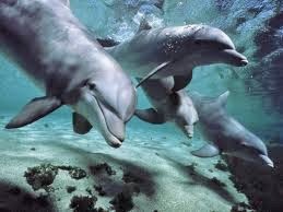
This is the original. This picture seemed pretty simple because the colors are monochromatic. There also aren't that many dolphins in the water so I thought it would be easy to crop.
.jpg)
When I cropped this picture, I wanted the dolphin in the foreground to be the main focus, but I didn't like the fact that I couldn't isolate this one dolphin completely. I still see a little of the other dolphins and it distracts me.

In this picture I used the selective focus tool again to zoom in and brighten up the main dolphin. I think this makes it more of a focal point.

This is the original image.
.jpg)
I cropped this image to make the elephant seem to stand alone, but I don't think it works well here. The chick has to be in the picture so it just looks like a smaller version of the original picture.
.jpg)
.JPG)
.JPG)
In this picture, I used the selective focus tool to draw focus to the branches in the middle. At first the contrast was so suddell that I barely noticed it, but then the more I studied it the more I noticed that there was a difference.

In this picture, I used the selective focus tool on a larger target area and I only used medium focus. The differences are almost unrecognizable so I think this tool works best when it is used on a smaller area.
.JPG)
.JPG)
Here, I zoomed in to try to show the glitter. I can see the glitter now but I couldn't lighten up the picture or else the contrast wasn't that noticeable. The picture is too dark.

Here, I was trying to lighten up the picture to show the contrast.

.JPG)
Here I used the Selective focus tool to add details to the KNICKS cupcake with writing, but I noticed that the other picture became blurry so I didn't love this picture. I also noticed that the picture looked really dark. I don't know if this is because I used the strongest focus of the Selection Tool.
.JPG)
I decided to just crop the bag away and lighten up the picture. This is the best one, but I've come to the conclusion that you can only make but so many improvements with editing a photo. Sometimes you need to take another original photo.
Pick 2 Exercises


This is the
exercise from DIY about border variations from page 197. It is odd to get it right on the first
try. Out of all of these pictures with
the border, I think the first one best compliments the picture. This one is uniform and the colors are
complimentary. The last one does add a
nice twist and color play. I think that
the pattern may distract from the picture but I like this one as well. The thickness of the border off sets the size
of the object. When the border is thick
it creates a balance and uniformity. I
really like the brightness and the color scheme. I had to look it up because I wasn’t sure
which color scheme was being utilized but I think it is an Analogous palettes. Three adjacent colors from the color wheel
are used. It also seems like it could be
Split-Complements because the greens are very similar and then the yellow adds
a pop. I’m not really sure but that is
why I struggled with color choices for the frames. The dark green is right next to the light
green on the color wheel so I thought it would look better but it is my least
favorite border.
Exercise: Color Echo (design basics index p.219)
.JPG)
.JPG)
.JPG)
Jennifer,
ReplyDeleteYou chose some really interesting and beautiful images. I think you did a nice job editing them to make them different, shifting the focus on different elements of the images. Your color echo exercise is really cool. The color palette is light and refreshing which I think invokes the essence of a lime. Really good job!
Sean
Jennifer,
ReplyDeleteI chose that first city image in my cropping exercise as well! It's a really great image to use. I like that you have different crops that have different focuses, as the original image is overwhelming with all the things happening in it. I also love the selective focus image of the taxis -- I've heard of the selective focus tool before but never had a chance to use it, but it looks like a great way to draw attention to things without cropping out the rest of the image. The third border in your borders exercise is very fun and matches the image well, too. I understand your frustration about the color palettes exercise; it's pretty hard to even get a color palette out of most software, but the image you chose is so vibrant it looks like you got the hang of it. Great job!